So then, class, let's get back to my posts about
consensus,
numbers, and
Cookie Monster proclaiming the end of the world, shall we...?
To review a bit:
A: We humans in general, and we Americans in particular, have a few problems that we need to figure out.
B: An important step in solving these problems is coming to a consensus on what, exactly, these problems are.
To which I now will add...
C: It would be very helpful if everyone started with the same facts, then, wouldn't it?
Or, put in to question format: What can be proven? What do the facts suggest, versus what is merely commonly held opinion? Put scientifically, then, what is actually observable in the world around us?
Let's take, as an example, the huge income disparity that now exists in America between its wealthiest citizens and everyone else. This can be represented in any number of ways, but let's simply take one statistic: today, the top 1% of Americans earn almost 25% of the income every year. Okay, big deal, big deal - what we need is more context, so let's compare it historically. Twenty five years ago, the figure was about half as much, at 12%. Turns out the last time this particular number was this high was in 1929.
Now, this is America, right? (Or, more globally speaking the internet. Readers from other countries, please bear with me for a bit...) You're free to think this is a good thing, or a bad thing. You can argue about the causes of the inequality, or its possible results. You can rephrase it, as in "Hey, the richest top ten percent pay 60% of the taxes." (Well, yeah, that's still saying the same thing, but less directly.) And, if all else fails, you can start to yell "Class Warfare" whenever someone who may vote you out of office brings it up.
What you can't do, however, is pretend otherwise, which is what it seems that many of us are doing. Here is a video of people taking a look at another statistic - the distribution of wealth in America.
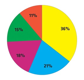
For those of you with slow internet connections (or those with aversions to Warren Buffet for whatever reason), skip ahead to around 1:15. To sum up: here is the chart that most Americans surveyed selected when asked to chose one that shows what wealth distribution in America looks like (yellow representing the share of wealth held by the top 20%):
Nope! Sorry, that's Sweden. Here's a chart that shows the actual distribution of wealth in the US:
Good thing? Bad thing? I've got my opinions on the subject, and I hope that you've got yours. What we can't do, however, is pretend like it's otherwise, or tell ourselves that it really doesn't matter. Unless you live in Sweden*.
*in which case, you may want to feel smug for a moment or two, and then start looking at statistics for wealth distribution globally...